The Barrier
The average person spends over six hours online every day. Whether you’re working, shopping, or reading the news, there’s a site for whatever you need. But even after thirty years since the launch of the World Wide Web, most websites still seem to be living in the DOS ages. Which means they’re not accessible for people with low vision and blindness. While many developers and companies are aware of accessibility guidelines, there are thousands of online spaces that either don’t meet them or haven’t implemented them correctly, resulting in a frustrating experience for half a million Aussies.

The Solution
Guide Dogs is on a mission to create a Boundless World for people with low vision or blindness, by removing the barriers that get in the way of accessing and enjoying the world. This includes making websites a little easier to navigate.
That’s why we’ve created these guidelines for brands and business owners to implement on their websites. They’re an extension of the Web Accessibility Initiative’s Guidelines (WCAG), commonly used by web developers, but with added tips, priorities, ideas and experiences from real people with low vision or blindness themselves. Below you’ll find simple advice and directions that you can implement today to improve the accessibility of your website – with little to no coding required.
- Make sure product descriptions are actually descriptive
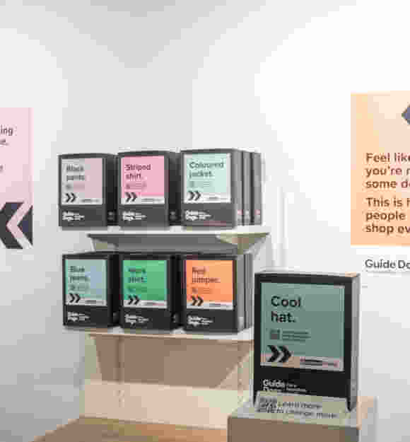
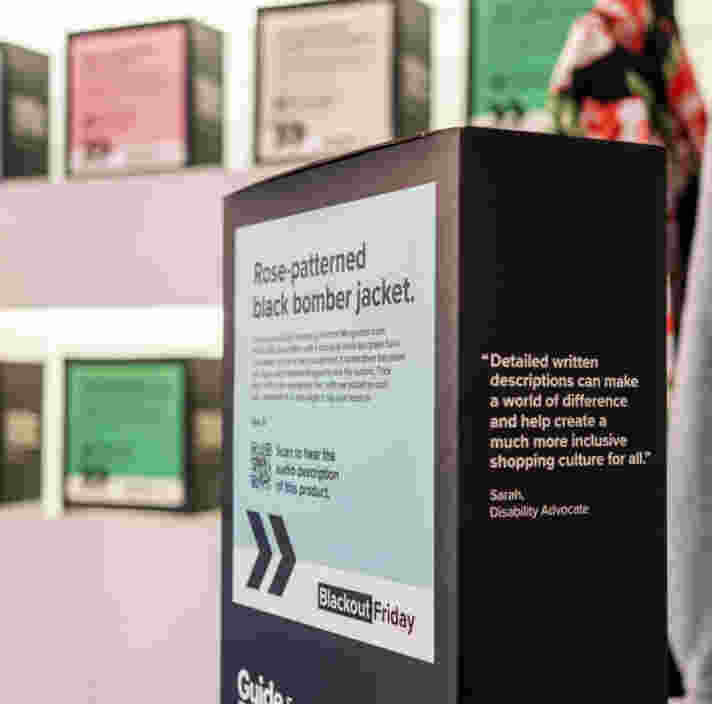
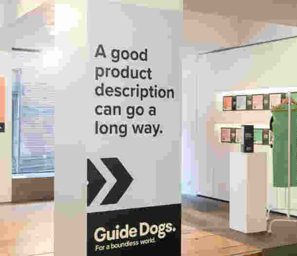
When writing your product descriptions, think about everything you’d want to know about something before buying it. Clothes descriptions, for example, should include notes on colour, pattern, texture, length, fit and feel. If you sell an appliance, does it have tactile buttons? Does your apparel have logos or embellishments? If your product has a pattern try to describe it beyond ‘multi’. Is it floral, animal print, rainbow, striped? Which animal? Thick stripes or thin? What kind of rainbow? Your product description should be easy to read, descriptive and add value for people whether they have low vision or blindness, or not. - Ensure all buttons and pages are labelled
You’d be surprised how many websites have buttons labelled just ‘Button One’ instead of their actual function, for example, add to cart. This is the text that gets read out by a screen reader when a person with low vision or blindness hovers over that button, so whenever you add one to your website, whether it’s a form submission or a navigational element, make sure it is clearly labelled so that users on a screen reader can easily navigate and click on the right thing. For similar reasons, it’s important that all your pages are labelled clearly, particularly when you get to search or filter results. This ensures they know that the page has loaded correctly and that they’re in the right place. - Make your modals friendly
‘Modals’ are interactive features on your website that often display on top of the existing page content – this may include chat features, pop ups, or address search fields. These can be incredibly difficult to navigate away from or explore if they’re not accessibly designed. For example, if you can’t see the ‘X’ to close a pop up, it stays popped up, trapping you in that part of the content, a common frustration for people with low vision or blindness! To make the experience easier, you can make it so that users can close the modal by pressing escape, increasing size and contrast of exit buttons, and having a manual option for your forms. While hard-to-find exit buttons might keep people on your pop up for longer it makes it ten times harder to get back to what they really want: your website! - Keep contrast in mind for reading
It can be tempting to play with contrast for visual effect. But strong contrast between the background colour and any important copy on top of it ensures that it can be read easily by a broad range of people and make for a smoother experience, whether it’s page text, exit buttons or form fields. This ensures that users with low vision can continue navigating your site, reading your content or completing their checkout, without having to ask for help or giving up on the site altogether. - Don’t rely on AI for descriptions
While writing detailed descriptions can be a bit time consuming, we’re not yet at a point where AI can consistently write helpful descriptions. We often find that AI focuses on the wrong things, for example, describing the background of the picture and not the product itself. Always review any AI generated content to ensure it is accurate and helpful. Ask yourself, would this help someone have a better understanding of your brand and offering? - Make your alt text count
Your alt text should describe the image without just being a repeat of the caption or product description, because if someone is using a screen reader they’ll need to listen to both. Key elements to include in your alt description are the view (front, back or side), any action happening in the image, if there is a size comparison in the image, what the model or person is doing, how the photo has been styled, or anything else that describes the image. It’s also important that you label visual elements on your site that are purely decorative, so that the screen reader can skip over these. For example, a little squiggle for visual effect doesn’t need to be described every time it appears. - Test your tick boxes on mobile
Do you struggle to find and check the tick boxes on your website when scrolling on mobile? Times that by ten for people with low vision and blindness. This might be something you can select in the design of your website or you might have to speak to your website developer to improve it, but ensuring that checklists or tick boxes are easy to click (with or without a screen reader) is something that can make your website better for everyone. - Have audio options for CAPTCHAs
Look for accessible CAPTCHAs that you can implement on your site, or at least make sure your chosen option includes audio options. These classic ‘robot’ tests can be tricky for anyone to navigate (what is a bus anyway?), so test out some options so that people who want to engage are able to. - Structure your site simply
Mobile scrolling has simplified many websites, but it’s not the only way to navigate a site and many people might be on desktop. This makes website structure super important. Think about the hierarchy of information (product name, price, description, specs and so on) and try to keep page structures as simple as possible. Multiple columns can be confusing to navigate with a screen reader, and similar product descriptions that split the information can be taxing for a screen reader. - Make it easy to talk to a human
Sometimes it is necessary to get a little help from someone on the inside. Whether someone wants to check if their order went through or they’re looking for more information about your products or services, make it easy for people to get in contact with a real life human. Quick contact forms or clearly stated customer service numbers can be the personal touch anyone might need to convert, and turn potential customers into brand advocates who keep coming back for more.
Website Accessibility Checklist
If you’re wanting a quick reference guide to ensure your website is accessible, download our checklist so you can review your site against the above guidelines, as well as more general best practice tips to follow.

Ready to continue?
Seems like you have filled this form earlier. Let’s pick up where you left off.

